Design takes too long?
Replace designers with a design-less tool.
Build functional UI in minutes with your sleek code-backed layouts.
Bring designers and devs closer than ever!

Design takes too long?
Replace designers with a design-less tool.
Build functional UI in minutes with your sleek code-backed layouts.
Bring designers and devs closer than ever!
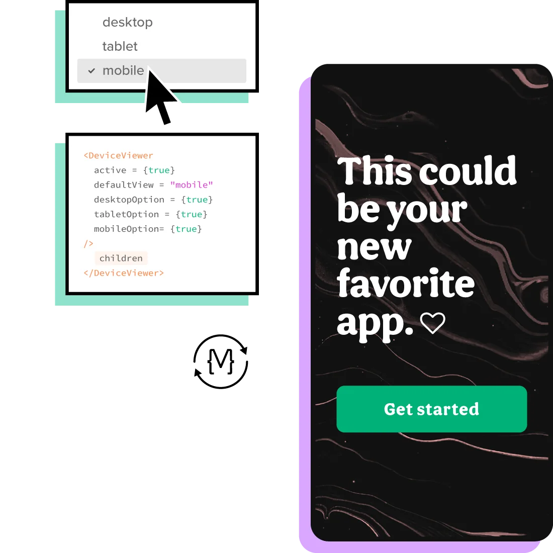
Import your components from


Scale your design operations
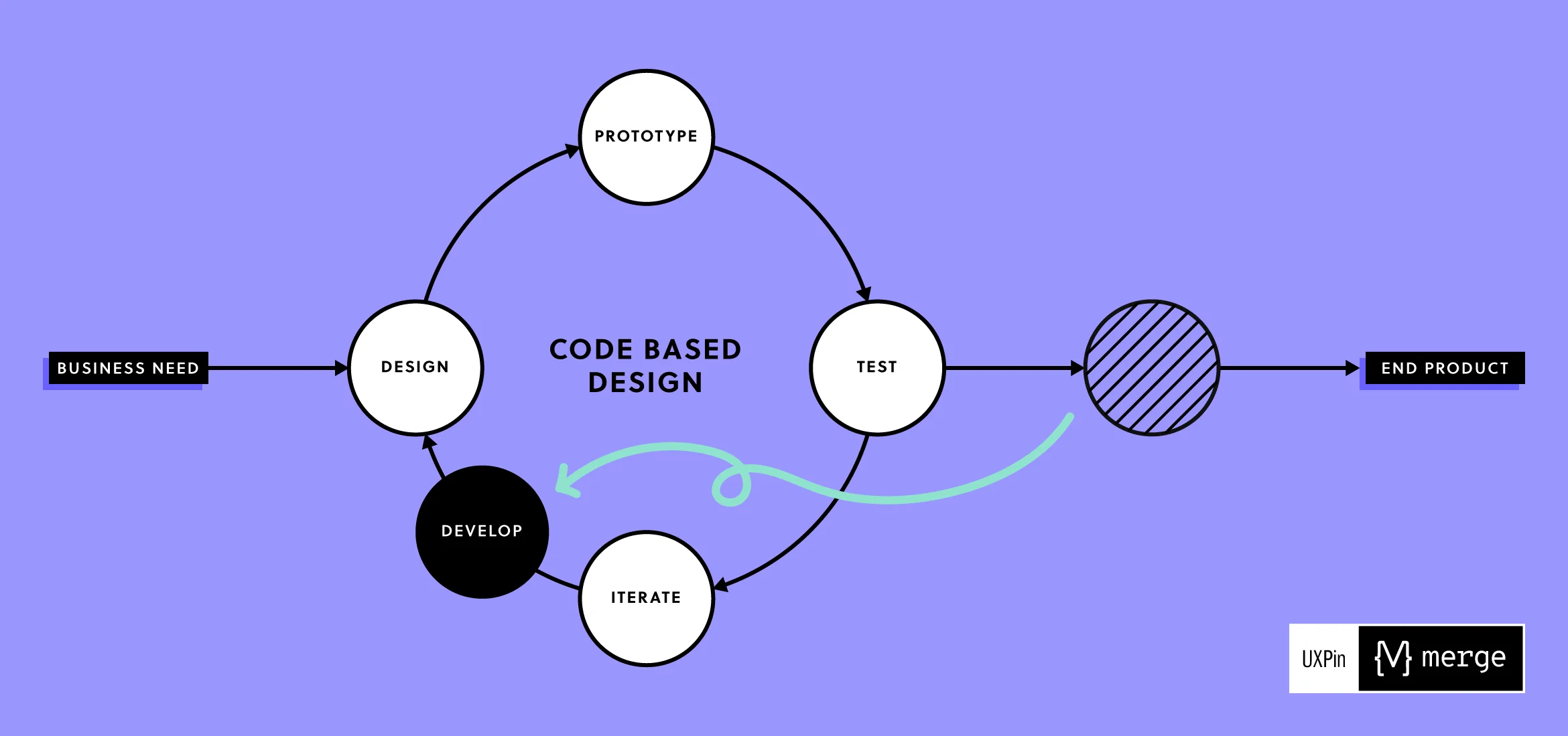
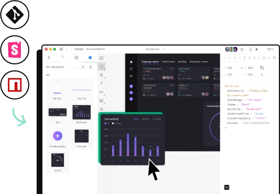
Speed up your product development process with revolutionary Merge technology. From UI designers to UI developers – create consistent interfaces using the same building blocks.
Create perfect prototypes right from the beginning
Build prototypes that feel like the end product. Get creative with our design tool or start with hundreds of built-in UI elements. Integrate with Storybook, Git repo, or NPM package and use code components straight from your design system, app or website.
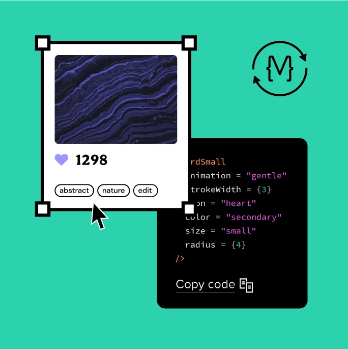
Code components
made for designers
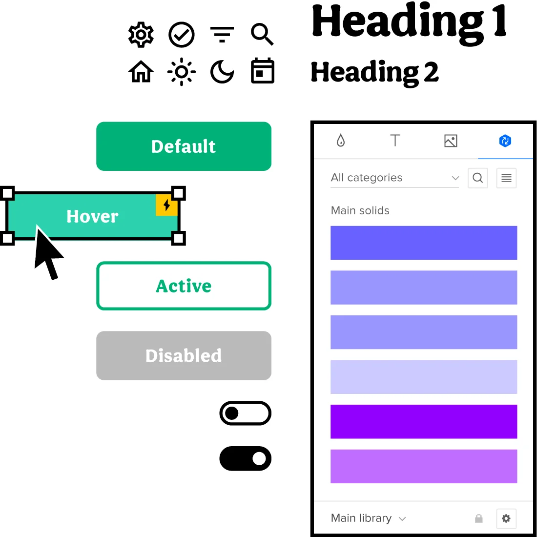
Design with the exact same UI code components that devs build the product with. No coding skills required – just drag and drop the elements.
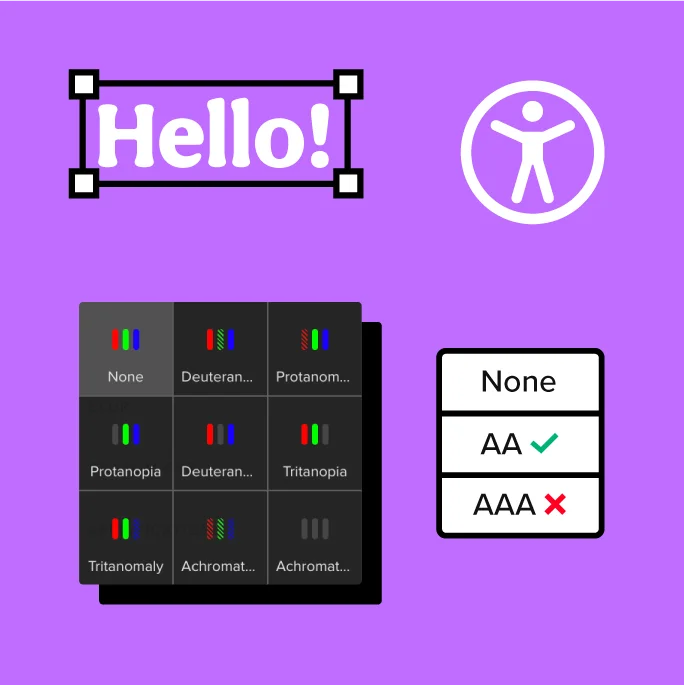
Make your
designs accessible
Design inclusive products in line with WCAG standards. Test your prototypes with built-in features like Contrast Checker and Color Blindness Simulator.
Build with user
experience in mind
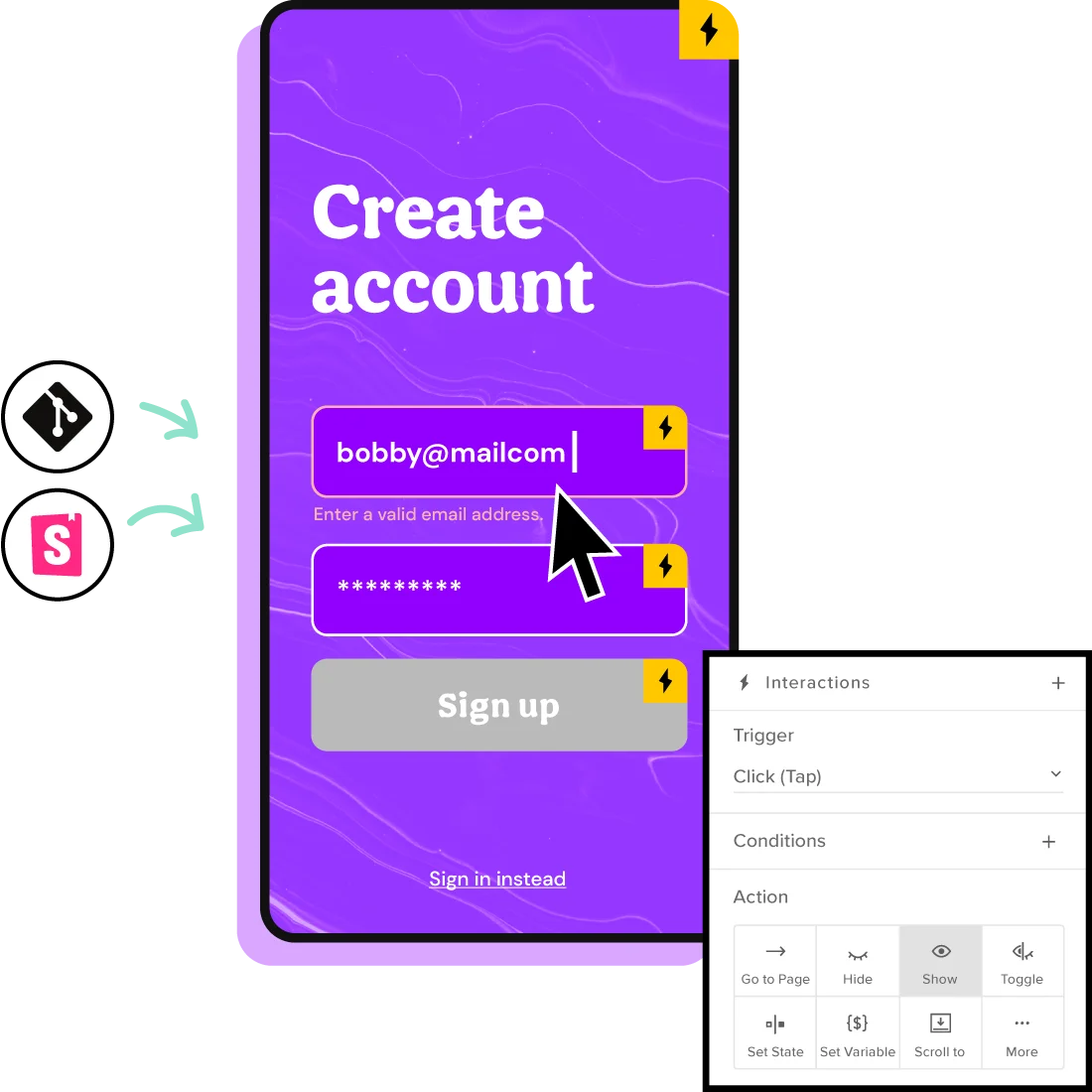
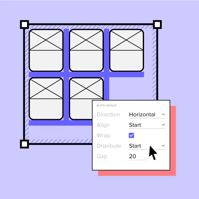
With States, Variables, Conditional Interactions and Auto Layout, your prototypes will perfectly mimic the end product experience, during usability testing.
Keep full consistency with Design Systems
Design at scale with dynamic and reusable design systems – your centralized place with interactive UI components and documentation. Share it easily with your team and ensure consistency across the whole company.
"It’s amazing to confidently tell my team that I can validate a design in a few days. I can prototype on Monday, test it Tuesday and Wednesday, and show results on Thursday."


Remote team collaboration
at its finest
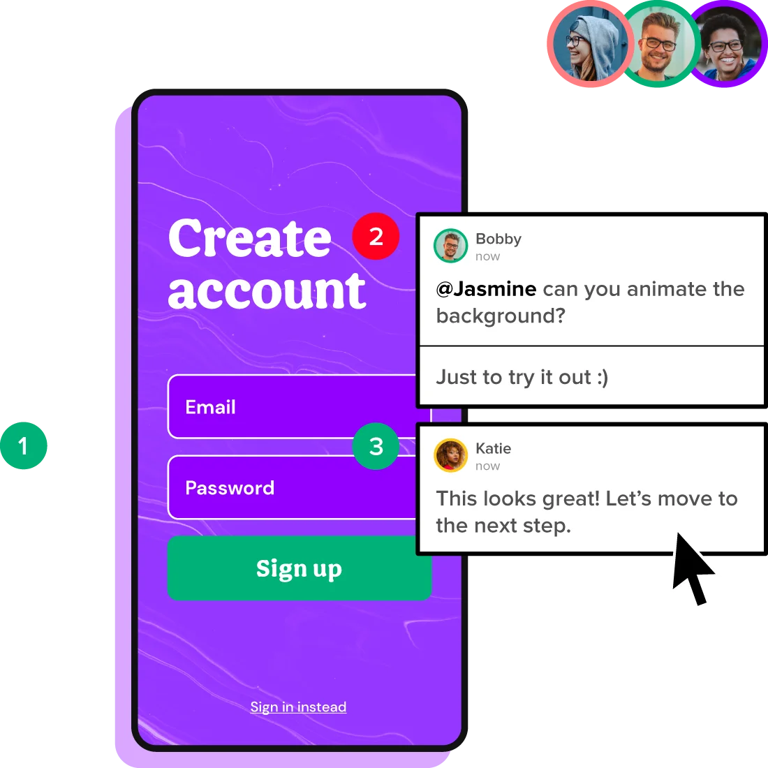
Easily share your designs and gather feedback from your team and stakeholders. Communicate seamlessly with developers and save time by reducing the handoff process to the absolute minimum.
Choose an easier way to build products together

Get everyone
on the same page
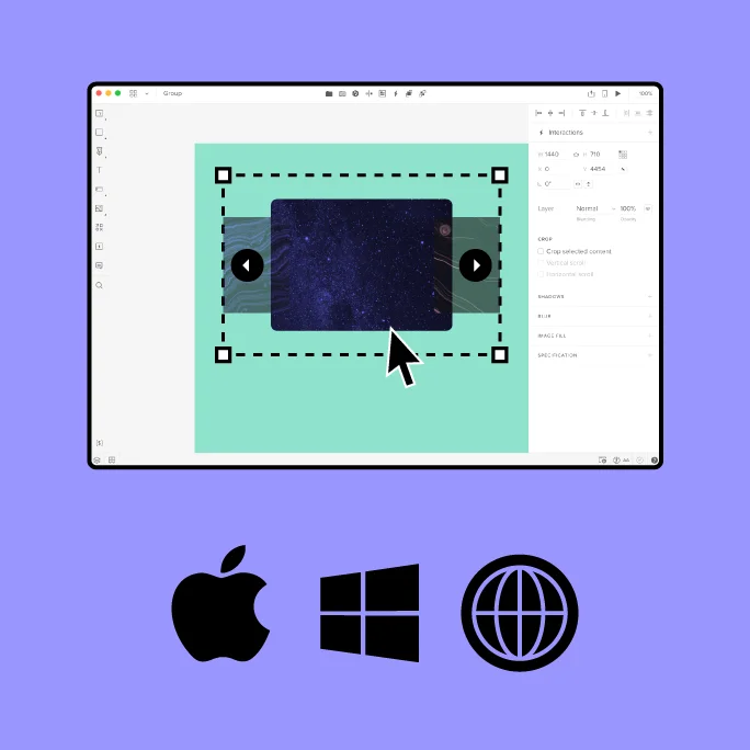
Wireframe, prototype and ideate together in real time. Work smoothly on Mac, Windows, or in the browser, to support your remote collaboration process.
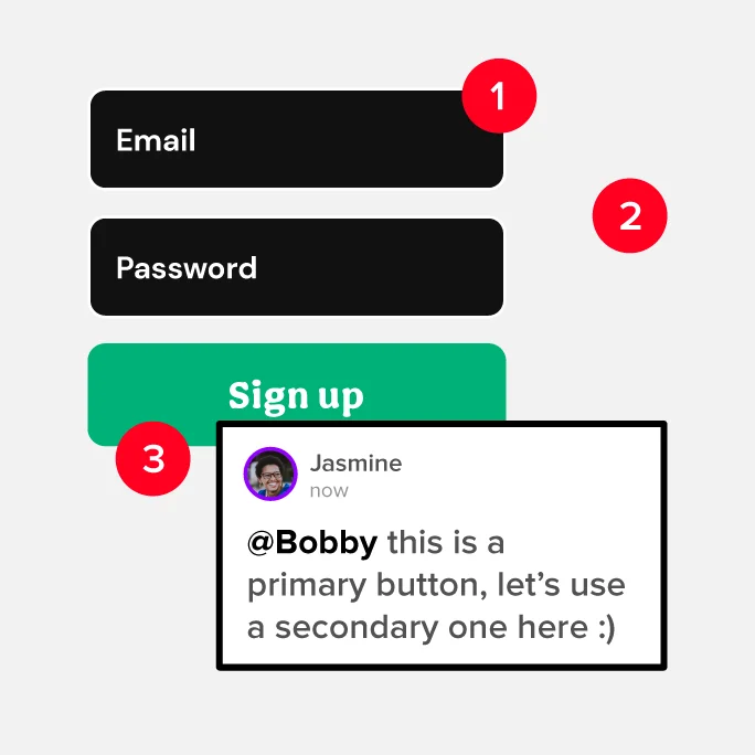
Collect and provide actionable feedback
Easily share your designs and ask for feedback. Tag your team members, assign comments, and make sure that you’re all on the same page.
Simplify your
handoff process
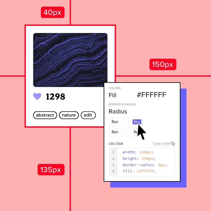
Send your designs to developers with all the specs, code, and automatic redlining. Work with code components and remove the handoff drift completely.
Build with DesignOps in mind
Work with UI code components as a common language and remove the translation drift from when design becomes the product.
UXPin is trusted by design leaders and product teams from top companies.


Centralize your
design process
Simplify your design tool stack – try UXPin Merge today and release digital products faster.


 Watch testimonial


